Tabs
This type of widget represents a Tabs block that can be useful like a block to order and configure a sub-layout inside the view.
Settings
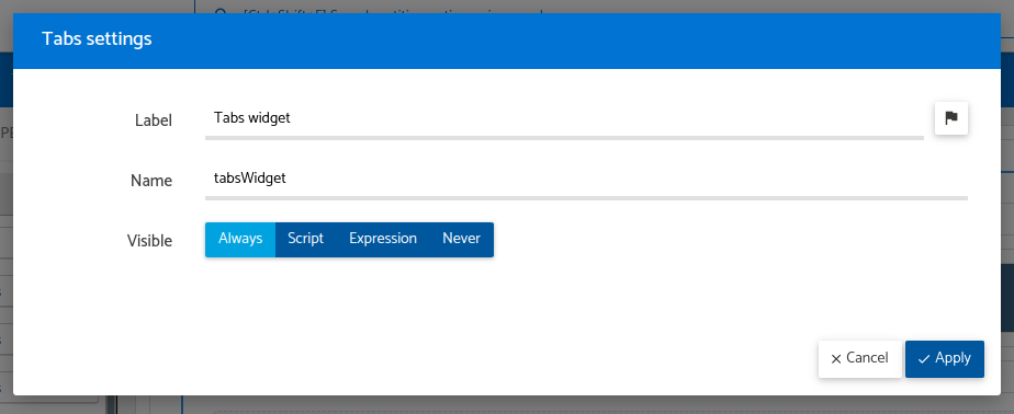
The available settings are described as below:
Label
This represents the human-readable widget label. It’s what appears in the heading section of the accordion when is displayed.
Name
This is the internal widget name, used as for database storage within entities.
The name must not contain special characters or spaces; only letters and numbers are allowed.
Visible
Indicates the visibility of the widget, can be configured with the following options:
Always: The widget is perpetually accessible.Script: When the script returnstrue, the widget becomes accessible; otherwise, it remains inaccessible. Here’s the script’s context:Parameters
Name Type Description record sys.data.Record This record is linked to the ongoing operation. Returns
boolean- You should returntrueif there is access to the widget,falseotherwise.Samples
// if 'numberOfExmployees' is bigger than 10, then this field is visible return record.field("numberOfEmployees").val() > 10;Expression: The widget becomes accessible if the expression evaluates totrue. More information is available in the Expressions documentation.Never: The widget will never be accessible.
Layout/Tabs
The layout tabs are configured adding sections through the add button so it’ll add the section with a row and column inside. The user will configure widgets, like configuring a normal row and column, building a sub-layout inside the global layout of the view. Below this section, you will see an example with pictures of how to build the layout and configure the accordion.
Like the accordion, sections can be configure. These have the following settings
Label
This represents the human-readable widget label. It’s what appears in the heading section of the accordion when is displayed.
Name
This is the internal widget name, used as for database storage within entities.
The name must not contain special characters or spaces; only letters and numbers are allowed.
Visible
Indicates the visibility of the widget, can be configured with the following options:
Always: The widget is perpetually accessible.Script: When the script returnstrue, the widget becomes accessible; otherwise, it remains inaccessible. Here’s the script’s context:Parameters
Name Type Description record sys.data.Record This record is linked to the ongoing operation. Returns
boolean- You should returntrueif there is access to the widget,falseotherwise.Samples
// if 'numberOfExmployees' is bigger than 10, then this field is visible return record.field("numberOfEmployees").val() > 10;Expression: The widget becomes accessible if the expression evaluates totrue. More information is available in the Expressions documentation.Never: The widget will never be accessible.
Example
All the settings except the layout can be configured clicked on the accordion container or on the configure widget button. You will see a view like this

The tab also has the settings

The layout will be configured adding sections by the add button and then with drag and drop the row/columns/widgets inside the accordion section block how to can see in the next picture.
