Using the editor
View Designer is a powerful and user-friendly interface editor designed to streamline the creation of flex record views. The editor is divided into two primary sections: the Toolbox section and the Canvas section. These sections work in tandem to provide a seamless design experience, allowing you to construct complex layouts with ease.
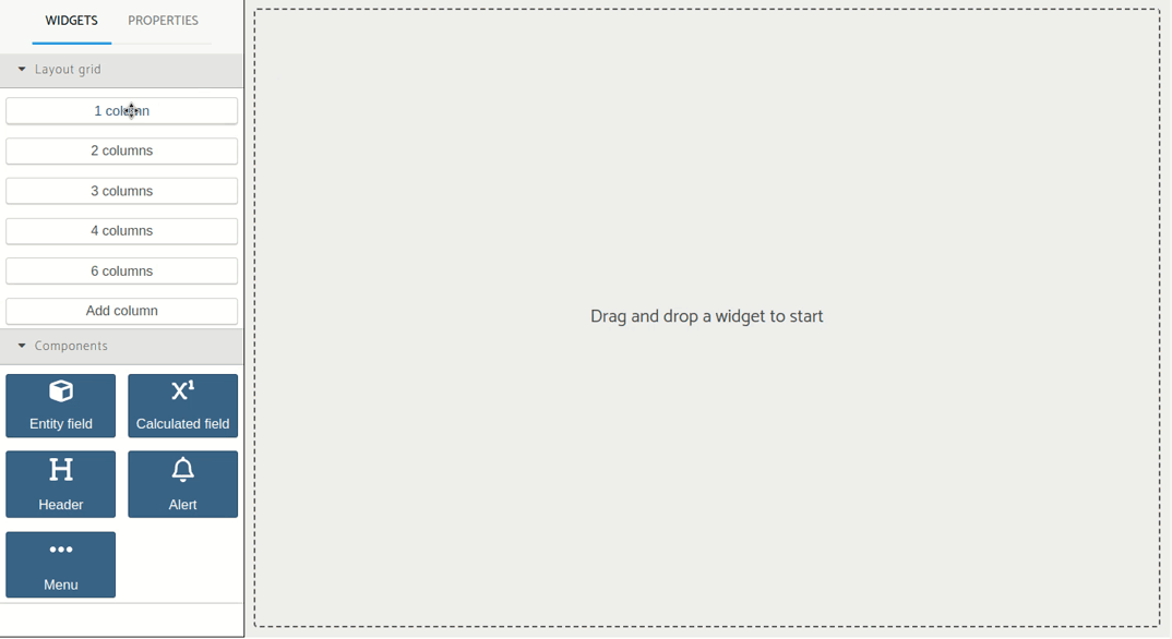
Toolbox section
The Toolbox section contains all the building blocks needed to create your interface. This section is further divided into two categories:
Layout Grid: Here, you’ll find various grid options that serve as the structural foundation for your design. Please refer to Layout grid for more details.
Components: This is where the functional elements of your interface reside. You can select from a range of widgets. Please refer to Components for more details.
Each widget in the Toolbox section can be easily dragged into the Canvas section. Additionally, there’s a convenient tab system that allows you to toggle between viewing available widgets and their respective properties of each widget.
Canvas section
The Canvas section is the visual workspace where your design takes shape. It’s a blank slate that beckons you to start creating by dragging and dropping widgets from the Toolbox section. The canvas represents an approximate of how it would look the flex view.
As you add widgets to the Canvas, you can rearrange, resize, and nest them within the layout grids to achieve the desired look and functionality. The Canvas section is designed to be flexible and responsive, ensuring your designs adapt to different screen sizes and devices.
Building views
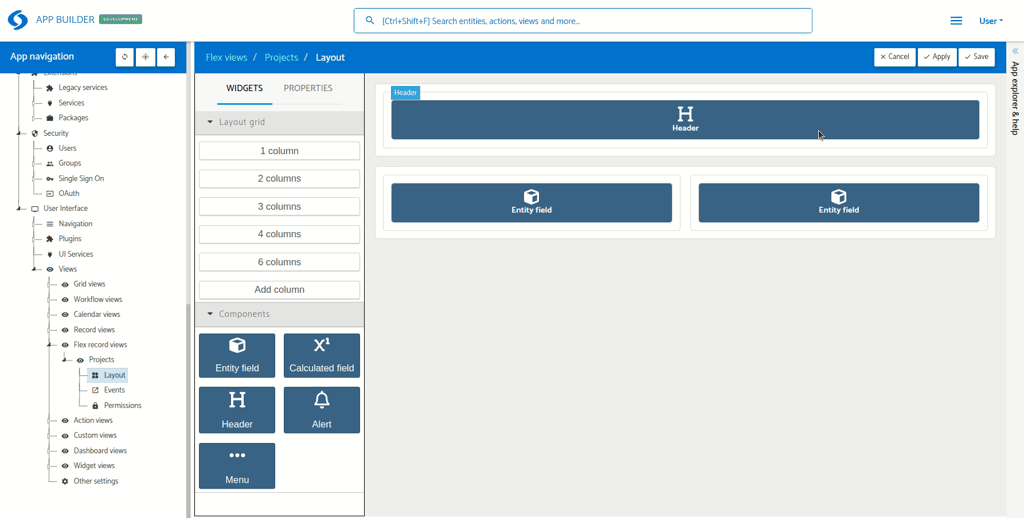
To begin using the View Designer, simply drag a widget from the Toolbox section to the Canvas section. It’s that straightforward. The intuitive drag-and-drop interface means there’s no steep learning curve, so you can focus on building complex views with no effort.
Configuring a widget
To configure the settings of a widget, just click the  icon that appears when selecting the desired widget, or you can also click on the
 Configure widget button in the Toolbox section. It will open a modal with widget specific settings.
Stacking widgets
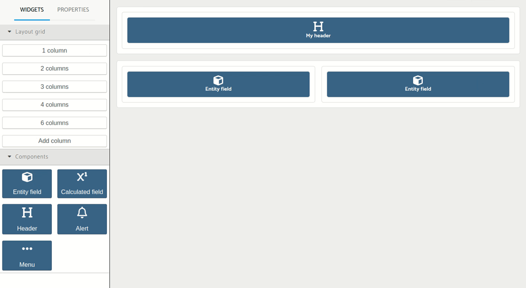
You can stack widgets within the same column by simply dragging and dropping a widget into a column that already contains items. This stacking feature is only possible to do it vertically.
Removing a widget
To remove a widget in the Canvas, just select it and click on the  icon.
icon.
Adding new columns
To add a new Column to a row, just drag the Add column item to an existing row.
Resizing a column

Resizing is straightforward: select the desired column, then drag the handler horizontally to either expand or shrink its size.
Properties
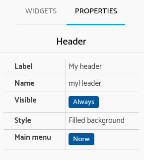
To take a quick look at the settings configured for a widget, you can switch the tab to Properties.