Flow designer overview
Overview
The flow designer is a visual drag-and-drop editor designed to simplify the creation and editing of flows within a Slingr app. To access it, follow these steps:
- Navigate to the
Buildersection of your app. - Look for a property that supports flows as an alternative.
- After selecting this option, an “Open editor” button should appear.
The flow designer consists of three main panels: the step’s palette, the canvas, and the properties panel.
The step’s palette
The step’s palette is located on the left side of the flow designer and contains all the available steps categorized for building a flow. To start creating a flow, simply drag a step from the palette and drop it onto the canvas. At the top of the panel, there is a search box that allows you to find steps by name.
<< icon located at its top side to maximize the size of the canvas.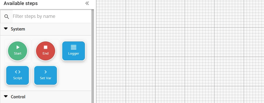
The canvas
The canvas is the central and primary panel of the flow designer. It’s a grid area where your flow, comprising steps and connections, takes shape. To add a step to the canvas, drag it from the palette and drop it onto the canvas. Once added, the step initializes, and its source or target connection’s endpoints appear on its sides. Double-clicking a step expands the right panel to show its properties.
You can rearrange steps within the canvas by dragging and dropping them. Connections between steps are maintained when you move them. The flow designer supports multi-selection of steps for convenience. To select multiple steps, hold the shift key and drag a selection area with your mouse. To deselect, press Escape or click an empty canvas area.
To delete a step, click it once to reveal a delete button in the top-right corner. Clicking this button removes the step from the canvas along with its associated connections.
The context stack
In the top right corner of the canvas, you’ll find the context stack. This special step cannot be deleted or connected, but you can reposition it. The context stack displays the values and variables available for use in the different steps of the flow. Learn more about this feature.
The properties panel
The properties panel is on the right side of the flow designer. It provides information related to the entire flow and individual steps. This information is displayed with editable forms for easy configuration.
Clicking the Settings button in the header displays general information about the flow, including its name, label, and description.
When you click on a step within the canvas, the properties panel displays settings specific to that step. The upper section includes basic properties like name, label, and description. The lower section allows you to configure inputs and outputs for that step. For more information on inputs and outputs, refer to the relevant section in the documentation. Feel free to use this improved and structured text in your documentation.
tab key on your keyboard to save those changes when navigating between tabs or steps. Please note that this action does not automatically save the changes upon closing the designer. To save your changes permanently, you need to click the Save or Apply button in the header.>> icon located at its top side to maximize the size of the canvas. Additionally, pressing the Escape key will also collapse the panel.double click on any step within the canvas to expand the properties panel and view the step properties.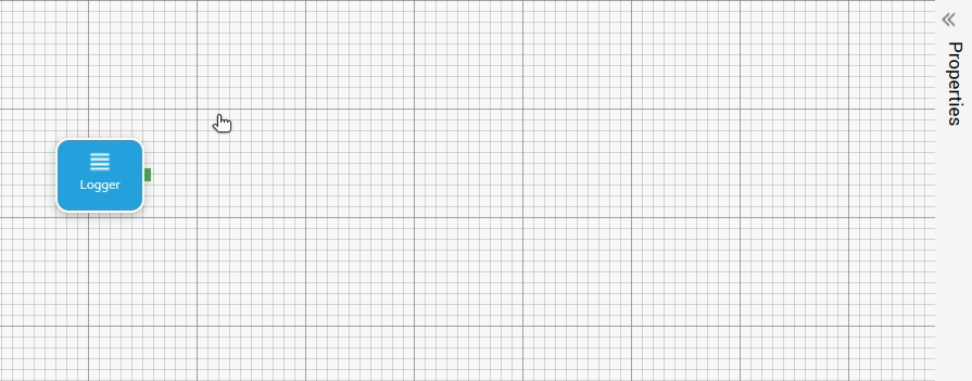
The header
At the top of the flow designer, you’ll find the header of the view in which you’ve opened it. This header is the same as that of the particular view, but you might notice that some buttons change when the flow designer is open. Here are the buttons displayed in the header when the flow designer is open:
Close: Closes the flow designer. If changes were made without saving, a warning prompt will appear before closing it.Reset: Reverts the flow and context stack to the state before the last save.Settings: Opens the properties panel and displays the general settings for the flow (such as name, label, and description).
Debug switcher will display information about the flow and how it is transformed into a JavaScript function in the monitor component.Full Screen: Toggles fullscreen mode on and off.Apply: Saves all changes made to the flow while keeping the flow designer open.Save: Saves all changes made to the flow and closes the flow designer.